Now that we have seen different types of charts, we are ready to create a few charts of our own using Google Spreadsheets. Since the procedure is pretty much the same for all types of charts while using Google Spreadsheets, we will limit ourselves to just two types of charts in this discussion.
Stacked column chart:
The following table lists the number of male and female employees of an organization during the years 1999 – 2004:
| Year | Male | Female |
|---|---|---|
| 1999 | 20 | 8 |
| 2000 | 45 | 19 |
| 2001 | 62 | 28 |
| 2002 | 41 | 21 |
| 2003 | 54 | 22 |
| 2004 | 62 | 32 |
We will create a 2D Stacked Column chart to represent this data.
Log in to your Gmail account and start a new google spreadsheet document. Save it under the name Stacked Column Chart.
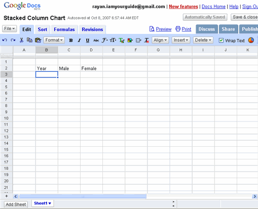
In cell B2, type in Year, in cell C2 Male and finally in cell D2 Female.
At this point your spreadsheet should look like the one shown below:
Complete the rest of the table in the google spreadsheet by filling in the below mentioned cell addresses with their respective cell contents. ( Note: the cell addresses point to the cell contents (which are in bold letters) with an arrow ->)
B3 -> 1999 C3 -> 20 D3-> 8
B4 -> 2000 C4 -> 45 D4 -> 19
B5 -> 2001 C5 -> 62 D5 -> 28
B6 -> 2002 C6 -> 41 D6 -> 21
B7 -> 2003 C7 -> 54 D7 -> 22
B8 -> 2004 C8 -> 62 D8 -> 32
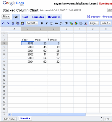
Your completed spreadsheet should look like the one below:
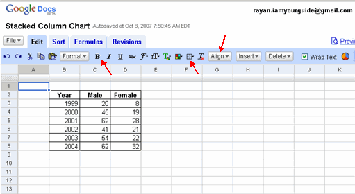
You may want to spruce up the table a little by making the column labels Year, Male, Female bold and align them centrally in their cells. Also enclose the table and its cells within borders as shown below. For formatting the table in this way the relevant buttons used are marked with a red arrow.
Now let us go to our main objective i.e. to draw a stacked column chart for this table.
Click on cell B2, hold the shift key and click on D8, so that the entire table gets selected as shown.
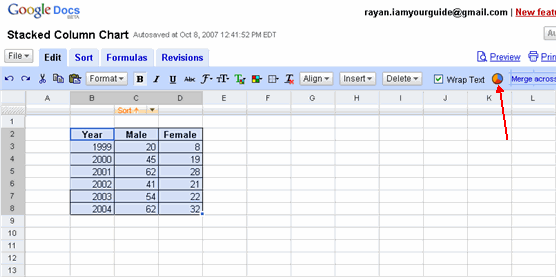
Now click on the Add Chart button on the toolbar as pointed by the arrow. This opens up the chart wizard as shown below. It also shows a preview chart ( on the bottom right corner)for our table with the default selection of column charts. But our type of chart slightly changes from the default values.
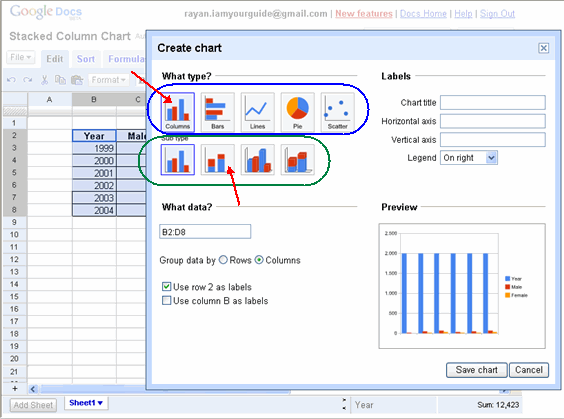
First we need to choose major type of chart that we want to draw. Let us select the columns ( which is pointed by the top arrow) as our major type.
Then within this major type we need to select the sub type of chart. Let us choose the 2D stacked column (which is pointed by the bottom arrow) as the sub type.
With those selections the preview chart changes as follows:
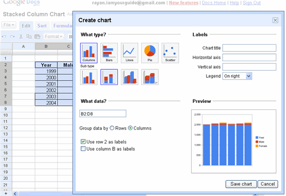
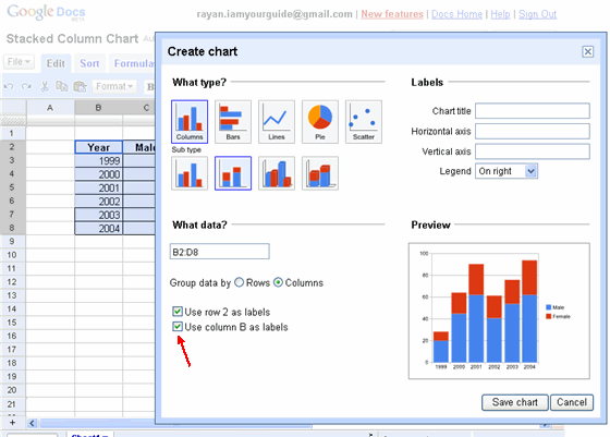
From the preview chart we can see that it comes close to what we have in mind but not quite. The reason for this is we want to show the change in employment levels for both Male and Female employees over the years 1999 – 2004. So we need to keep the years out of the chart and keep them as labels along the X – Axis. For this we need put a check mark on the option Use Column B as labels.
Once we exercise this option, the preview chart changes to the way want.
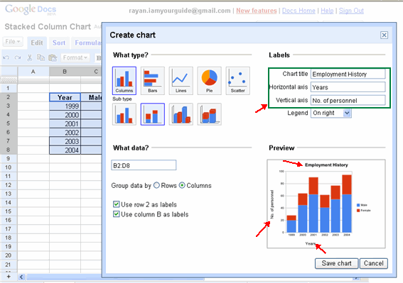
Before we could save the chart and close the chart wizard, we need to give a title for this chart as well as name the horizontal and vertical axis.
Now type in Employment History against chart title box. Name the horizontal axis box as Years and the vertical axis box as No. of personnel as pointed by the top arrow. Note even as we type in these names, the preview chart keeps with these changes and reflects the changes made. At this point the preview chart is seen as below:
Now that we are satisfied that the preview chart shows the way we want our final chart to be, we can click on the Save chart button below the preview chart. This closes the chart wizard and places a completed chart on our spreadsheet.
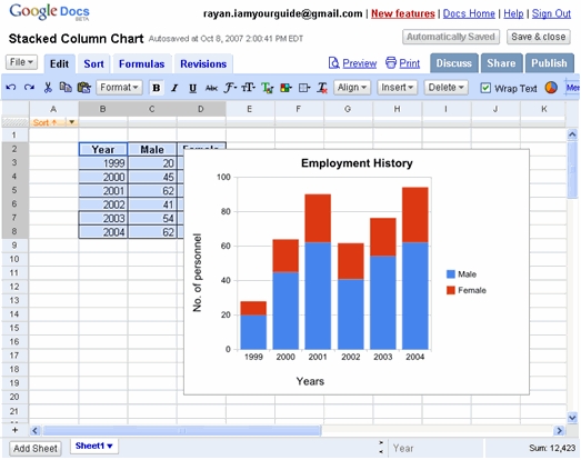
As we could see the default placement obscures some details of the table. No worry. We can move the chart around and place it anywhere within this sheet that is convenient to us.
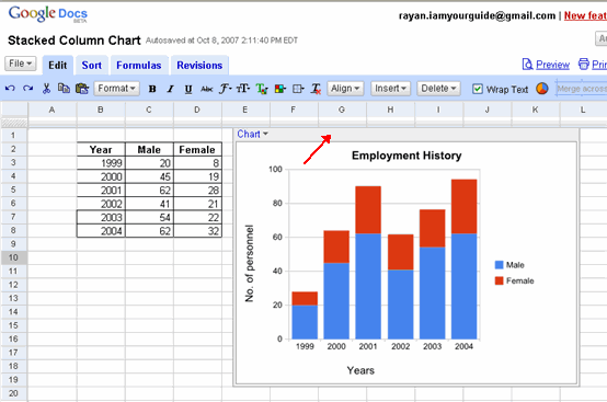
For this we need to click on the chart which its border. The top border pointed by the arrow acts like an handle. Clicking and holding this top border we can move this chart any where we want with in this chart. So this chart was thus moved to the right and placed next to the table. Once we move the chart to the desired location, we need click anywhere outside the chart to place it permanently in that location. Now we see that the chart gives a good visual representation of the data in the table.
But how do we deduce the exact data from the chart itself, though we can arrive at approximate figures from it?
For instance in the year 2001, the number of male employees were a little over 60. But exactly how many?
For this we just need to click on the blue colored region of the column for the year 2001 (as pointed by the red arrow) and Google spreadsheet pops up a box to show the exact details. This is as shown below:
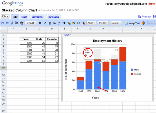
As we could see the exact value 62 for male employees for the year 2001 (in red circle) shown in the box. We can dispose of the box by clicking the close button X in top right corner of this box.
Pie chart:
The table below lists the total number (362) of problems solved by a computer repair shop in a month and their causes:
| Cause of problem | Number of occurrences |
|---|---|
| Affected by Viruses | 134 |
| Power supply failure | 24 |
| Memory Failure | 25 |
| Hard Drive Failure | 37 |
| Motherboard Failure | 12 |
| Hardware Upgrade | 130 |
We will create a 2D Pie chart to represent this data.
Open a new Google spreadsheet. Save it under the name Computer Repairs. (At this point if you have logged out, please log in to Gmail account again to access Google Spreadsheets)
Type in the above table in the google spreadsheet by filling in the below mentioned cell addresses with their respective cell contents. ( Note: the cell addresses point to the cell contents (which are in bold letters) with an arrow ->)
B3 -> Cause of problem C3 -> Number of occurrences
B4 -> Affected by Viruses C4 -> 134
B5 -> Power supply failure C5 -> 24
B6 -> Memory Failure C6 -> 25
B7 -> Hardware Upgrade C7 -> 130
At this point the table looks as shown below:
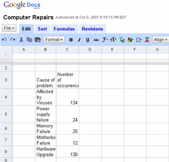
Do the following formatting to make it presentable.
1. Adjust the column width using the double headed arrows to reveal the contents of the labels in row 3.
2. Make the labels in cells B3 and C3 stand out in bold format by clicking on the B button on the tool bar as pointed by the arrow.
3. Apply borders around the table and individual cells. (Use borders button on the tool bar as shown by the arrow)
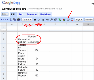
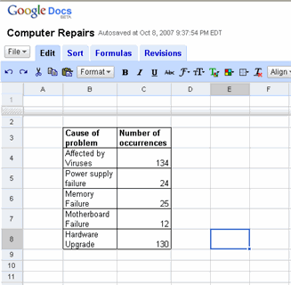
Your completed spreadsheet should look like the one below:
Now select the entire table by clicking on cell B3 and holding shift key and then clicking on cell C8. With the entire table selected, click on Add Chart button on the tool bar to start Chart Wizard. The entire sequence is as shown below:
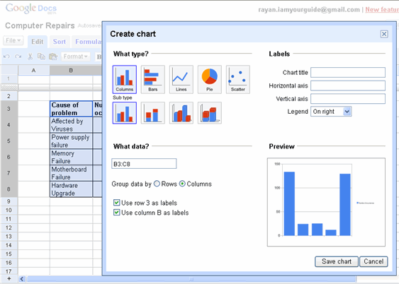
As usual Google Spreadsheets has chosen Column Type as a default chart for this table. Let us ignore the default selection and choose Pie Chart as the main type and within this main type select 3D Pie Chart as a sub type.
With our selection the preview chart changes as follows:
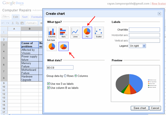
There is one last step before we save the chart and close the wizard. i.e. to give a title to this chart.
For this you type in Computer Repairs in the Chart Title box. As you might have noticed in a Pie Chart there are no Horizontal and Vertical Axis to worry about and as such the title boxes for these are disabled.
Now click on the Save Chart button below the preview chart and close the wizard.
At this point the Pie Chart is ready and is shown as below on the spread sheet.
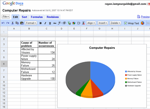
As is normal we may need to reposition the table on the spreadsheet to make it elegant.
For this we need to click on the chart and use the top border that appears as a handle to move the chart around and position it wherever we want.
Also want to know for what and how much each segment of the Pie Chart stand for. For this we need only to click on the segment we are interested in. Up comes a box that gives the details of the segement as shown below:
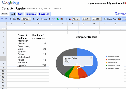
As we could see from the chart the yellow segment stands for Memory Failure and has happened 25 times and contributed to 7.7% of the total failure.
We can close this box by clicking on the X marked button at the top right hand corner of this box.
<--BackTo: Examples of each type of chart
Next: Chapter 4 Working with Lists –>